
HUST Gearbox公开数据集(含4种转速工况)

继前期推荐的公开数据集:
今天给大家推荐一个齿轮箱故障公开数据集,该数据集有4种转速工况,3种健康状态,诊断起来更具有挑战性。该数据集是由华中科技大学沈卫明老师团队在2024年公开,因此目前基于该数据集的论文不是很多,小伙伴们赶紧用起来吧!对于研究齿轮故障诊断的小伙伴们,再也不用担心写论文找不到数据啦!
数据集基本信息
目录
3.1 数据读取
3.2 绘制时域图
3.3 绘制频域图
3.4 绘制stft时频域图
1 实验简介
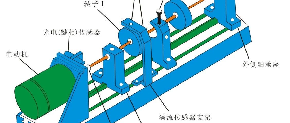
齿轮箱故障试验使用Spectra-Quest机械故障实验台进行,如图1所示。

图1 HUST齿轮箱数据集实验台
实验台上从左到右依次为①速度控制器、②电机、③加速度传感器、④变速箱和⑤数据采集卡。
(1) 正常 (2) 断齿 (3) 缺齿 需要注意的是,所有故障都是人为设置的,故障是在小齿轮上。
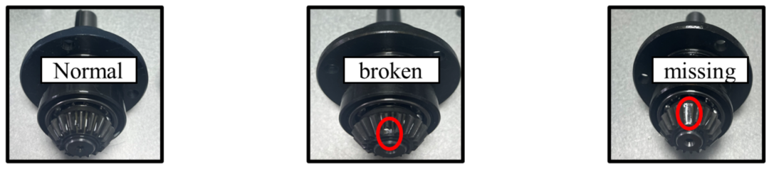
图2 故障齿轮照片

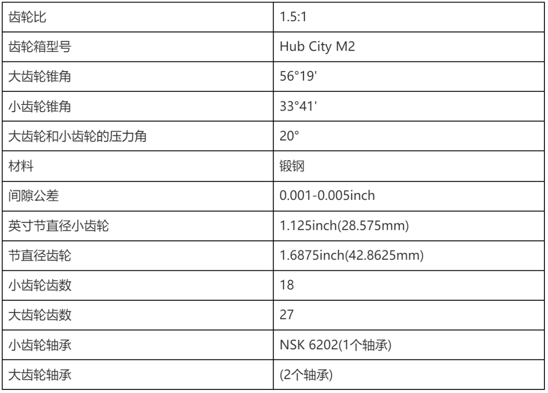
图3 齿轮箱的照片
图3为齿轮箱,其详细信息如下:
实验共设置了4种不同的运行工况。运行工况(转速和负载)包括:
20 Hz(1200rpm)、0.113Nm; 25 Hz(1500rpm)、0.226Nm; 30 Hz(1800rpm)、0.339Nm; 35 Hz(2100rpm)、0.45Nm。
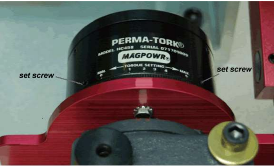
转速由调速装置调节,负载由负载控制装置调节。负载控制装置如图4所示。
用于数据采集的加速度传感器如图5所示,传感器参数如图6所示。具体信号采集设置如图7所示。
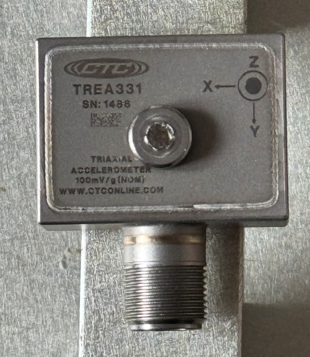
图5 三向加速度传感器的照片
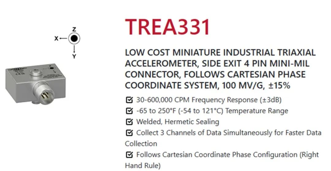
图6 传感器参数
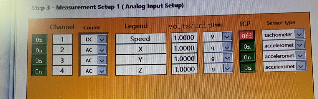
图7 信号采集设置
1.5 采样设置

图8 文件描述
2 数据集细节
原始数据文件包括12个文件(3个健康状态乘以4个工况条件),每个文件为txt格式。例如,文件名“B_20_1”表示在20Hz和0.113Nm工况条件下发生断齿故障。
H:健康
B:断齿
M:缺齿
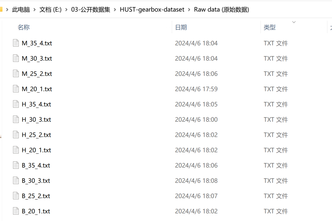
图9 文件夹数据
3 数据读取与展示
3.1 数据读取
## 导入包from matplotlib import pyplot as pltfrom matplotlib import rcParamsimport numpy as npimport pandas as pdimport osconfig = {"font.family": 'serif', # 衬线字体"font.size": 14, # 相当于小四大小"font.serif": ['SimSun'], # 宋体"mathtext.fontset": 'stix', # matplotlib渲染数学字体时使用的字体,和Times New Roman差别不大'axes.unicode_minus': False # 处理负号,即-号}rcParams.update(config)def data_read(file_path):""":fun: 读取xls数据:param file_path: 文件路径:return df:"""df = pd.read_csv(file_path)[13:] # 第13行开始为加速度数据df.columns = ['Column']# 使用 split 方法分割每行的单元格,expand=True 会将分割后的每个元素作为单独的列返回df_split = df['Column'].str.split('\t', expand=True)# 将分割后的所有列转换为 float 类型df_split = df_split.astype(float)# 重置索引,以便将分割后的列与原始 DataFrame 的索引对齐df_split.reset_index(drop=True, inplace=True)# 现在 df_split 包含了分割后的五列数据# 为这些新列设置列名df_split.columns = ['Time', 'Speed', 'Acc_x', 'Acc_y', 'Acc_z']return df_splitfile_path = r'E:/03-公开数据集/HUST-gearbox-dataset/Raw data (原始数据)/B_20_1.txt'df = data_read(file_path)acc_z_arr= df['Acc_z']df
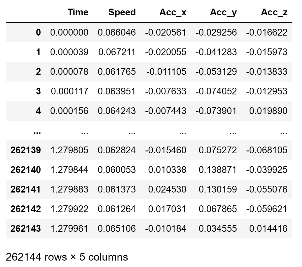
图8 一个txt文件内具体内容
3.2 绘制时域图
##========绘制时域信号图========##def plt_time_domain(arr, fs=1600, ylabel='Amp($m/s^2$)', title='原始数据时域图', img_save_path=None, x_vline=None, y_hline=None):""":fun: 绘制时域图模板:param arr: 输入一维数组数据:param fs: 采样频率:param ylabel: y轴标签:param title: 图标题:return: None"""import matplotlib.pyplot as pltplt.rcParams['font.sans-serif'] = ['SimHei'] # 显示中文plt.rcParams['axes.unicode_minus'] = False # 显示负号font = {'family': 'Times New Roman', 'size': '20', 'color': '0.5', 'weight': 'bold'}plt.figure(figsize=(12,4))length = len(arr)t = np.linspace(0, length/fs, length)plt.plot(t, arr, c='g')plt.xlabel('t(s)')plt.ylabel(ylabel)plt.title(title)if x_vline:plt.vlines(x=x_vline, ymin=np.min(arr), ymax=np.max(arr), linestyle='--', colors='r')if y_hline:plt.hlines(y=0.2, xmin=np.min(t), xmax=np.max(t), linestyle=':', colors='y')#===保存图片====#if img_save_path:plt.savefig(img_save_path, dpi=500, bbox_inches = 'tight')plt.show()
fs = 25600file_name = r'B_20_1.txt'##=====绘制时域数据====##time_img_save_path = file_path.replace('.txt', '时域_.png')plt_time_domain(acc_z_arr, fs=fs, title=file_name, img_save_path=time_img_save_path)
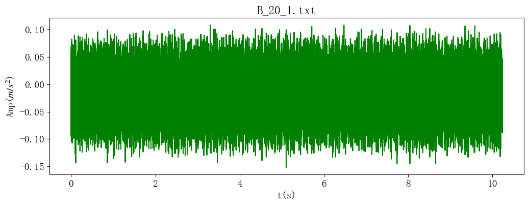
共10.2s的数据,单位
3.3 绘制频域图
##========绘制频域信号图========##def plt_fft_img(arr, fs, ylabel='Amp(mg)', title='频域图', img_save_path=None, vline=None, hline=None, xlim=None):""":fun: 绘制频域图模板:param arr: 输入一维时域数组数据:param fs: 采样频率:param ylabel: y轴标签:param title: 图标题:return: None"""# 计算频域幅值length = len(arr)t = np.linspace(0, length/fs, length)fft_result = np.fft.fft(arr)fft_freq= np.fft.fftfreq(len(arr), d=t[1]-t[0]) # FFT频率fft_amp= 2*np.abs(fft_result)/len(t) # FFT幅值# 绘制频域图plt.figure(figsize=(12,4))plt.title(title)plt.plot(fft_freq[0: int(len(t)/2)], fft_amp[0: int(len(t)/2)], label='Frequency Spectrum', color='b')plt.xlabel('频率 (Hz)')plt.ylabel('幅值')plt.legend()if vline:plt.vlines(x=vline, ymin=np.min(fft_amp), ymax=np.max(fft_amp), linestyle='--', colors='r')if hline:plt.hlines(y=hline, xmin=np.min(fft_freq), xmax=np.max(fft_freq), linestyle=':', colors='y')#===保存图片====#if img_save_path:plt.savefig(img_save_path, dpi=500, bbox_inches = 'tight')if xlim: # 图片横坐标是否设置xlimplt.xlim(0, xlim)plt.tight_layout()plt.show()
fs = 25600file_name = r'B_20_1.txt'##=====绘制频域数据====##fft_img_save_path = file_path.replace('.txt', '频域_.png')plt_fft_img(acc_z_arr, fs=fs, title=file_name, img_save_path=fft_img_save_path)
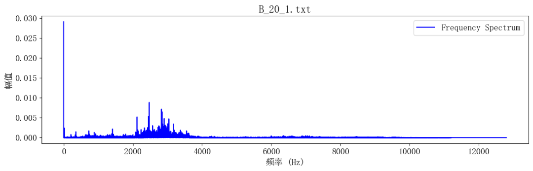
可见频率集中在中高频(2000-4000Hz)。
3.4 绘制stft时频域图
def plt_stft_img(arr, fs, ylabel='Amp(mg)', title='频域图', img_save_path=None, vline=None, hline=None, xlim=None):""":fun: 绘制stft时频域图模板:param arr: 输入一维时域数组数据:param fs: 采样频率:param ylabel: y轴标签:param title: 图标题:return: None"""import scipy.signal as signalimport numpy as npimport matplotlib.pyplot as pltf, t, nd = signal.stft(arr, fs=fs, window='hann', nperseg=128, noverlap=64,nfft=None,detrend=False, return_onesided=True, boundary='odd', padded=False, axis=-1)# fs:时间序列的采样频率, nperseg:每个段的长度,默认为256(2^n) noverlap:段之间重叠的点数。如果没有则noverlap=nperseg/2#window :字符串或元组或数组,可选需要使用的窗。# #如果window是一个字符串或元组,则传递给它window是数组类型,直接以其为窗,其长度必须是nperseg。# 常用的窗函数有boxcar,triang,hamming, hann等,默认为Hann窗。#nfft :int,可选。如果需要零填充FFT,则为使用FFT的长度。如果为 None,则FFT长度为nperseg。默认为无# detrend :str或function或False,可选# 指定如何去除每个段的趋势。如果类型参数传递给False,则不进行去除趋势。默认为False。# return_onesided :bool,可选# 如果为True,则返回实际数据的单侧频谱。如果 False返回双侧频谱。默认为 True。请注意,对于复杂数据,始终返回双侧频谱。# boundary :str或None,可选# 指定输入信号是否在两端扩展,以及如何生成新值,以使第一个窗口段在第一个输入点上居中。# 这具有当所采用的窗函数从零开始时能够重建第一输入点的益处。# 有效选项是['even', 'odd', 'constant', 'zeros', None].# 默认为‘zeros’,对于补零操作[1, 2, 3, 4]变成[0, 1, 2, 3, 4, 0] 当nperseg=3.# padded:bool,可选# 指定输入信号在末尾是否填充零以使信号精确地拟合为整数个窗口段,以便所有信号都包含在输出中。默认为True。# 填充发生在边界扩展之后,如果边界不是None,则填充为True,默认情况下也是如此。# axis :int,可选# 绘制STFT时频域图plt.figure(figsize=(12,4))plt.pcolormesh(t, f, np.abs(nd), vmin = np.min(np.abs(nd)), vmax = np.max(np.abs(nd)))plt.title(title)plt.xlabel('时间(t)')plt.ylabel('频率 (Hz)')if vline:plt.vlines(x=vline, ymin=np.min(fft_amp), ymax=np.max(fft_amp), linestyle='--', colors='r')if hline:plt.hlines(y=hline, xmin=np.min(fft_freq), xmax=np.max(fft_freq), linestyle=':', colors='y')#===保存图片====#if img_save_path:plt.savefig(img_save_path, dpi=500, bbox_inches = 'tight')if xlim: # 图片横坐标是否设置xlimplt.xlim(0, xlim)plt.tight_layout()plt.show()
fs = 25600file_name = r'0.5X_B_65Hz.xls'##=====绘制STFT时频域数据====##stft_img_save_path = file_path.replace('.xls', '时频域_.png')plt_stft_img(acc_z_arr, fs=fs, img_save_path=stft_img_save_path)
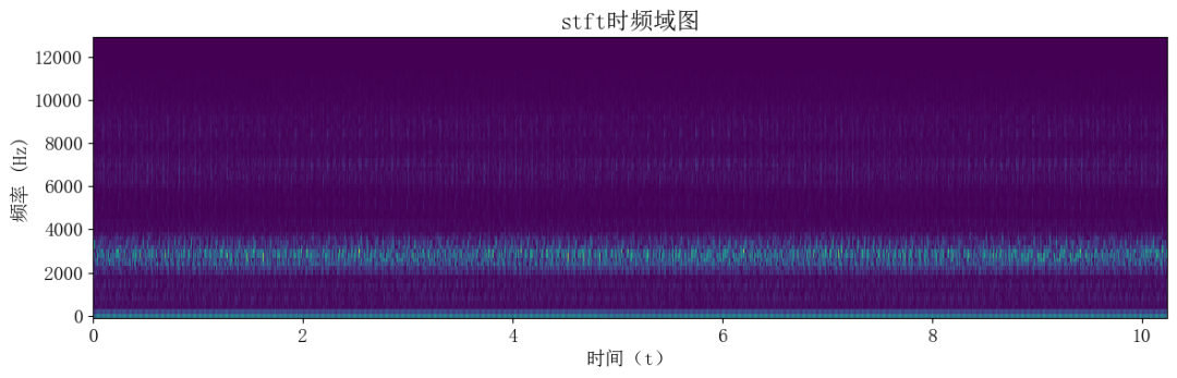
与fft频域图一致,频率主要集中在中高频(2000-4000Hz)。
数据集获取方法:后台回复“HUST齿轮故障数据集”
大家还想要什么数据集,欢迎在留言区评论,小编尽可能的满足。
登录后免费查看全文
著作权归作者所有,欢迎分享,未经许可,不得转载
首次发布时间:2024-05-10
最近编辑:2年前

硕士
签名征集中


相关推荐
最新文章
热门文章
