
MATLAB与Python绘图区别2—条形图


上次推文中,描述了MATLAB与Python在绘制折线图上的区别。那么我们今天继续学习,在绘制条形图时,两者之间的区别。
(1)Python
import matplotlib.pyplot as pltplt.rcParams['font.sans-serif']=['SimHei']plt.rcParams['axes.unicode_minus']=Falseyear = [2016,2017,2018,2019,2020,2021]number_1 = [25,26,30,35,37,40]number_2 = [35,46,50,65,57,70]plt.subplot(121)x = range(len(year))plt.xticks(x,year)plt.bar(x,number_1,label='报考情况',color='red')plt.xlabel('报考年数')plt.ylabel('报考人数/万人')plt.title('研究生报考情况')plt.legend()plt.show()plt.subplot(122)x = range(len(year))plt.xticks(x,year)plt.bar(x,number_1,label='报考情况',color='red',width=0.4)plt.bar([i+0.4 for i in x],number_2,label='报考情况',color='blue',width=0.4)plt.xlabel('报考年数')plt.ylabel('报考人数/万人')plt.title('研究生报考情况')plt.legend()plt.show()
其绘制的条形图如下图所示:
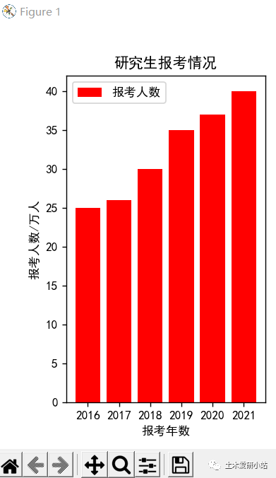
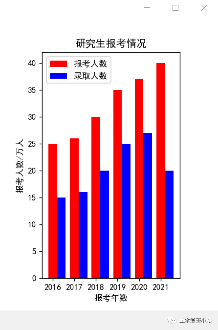
关于在Python学习条形图的绘制,方法如下图所示:

(2)MATLAB
clc;clear;year=[2016 2017 2018 2019 2020 2021]number_1=[25 26 30 35 37 40]number_2=[15 16 20 25 27 20]number_3=[25 26 30 35 37 40;15 16 20 25 27 20]subplot(1,2,1)bar(year,number_1,0.5,'r')xlabel('报考年数')ylabel('报考人数/万人')title('研究生报考情况')legend('报考人数')subplot(1,2,2)bar(year,number_3,0.5)xlabel('报考年数')ylabel('报考人数/万人')title('研究生报考情况')legend('报考人数','录取人数')
则其绘制的条形图如下图所示:

登录后免费查看全文
著作权归作者所有,欢迎分享,未经许可,不得转载
首次发布时间:2023-08-16
最近编辑:3年前

硕士
不怕困难,勇往直前

相关推荐
最新文章
热门文章
